

Studies suggest that volunteerism is on the decline, although most Americans agree that they care about giving back to their community.
The challenge for my team was to design an app that would enable and excite users to microvolunteer and recruit others too as well. Our designs built off the work from a previous UX team.
The previous UX team provided wireframes for a gamified, microvolunteering app. We wanted to research gamification techniques and the idea of microvolunteering in order to understand our problem space. Below is a summary of our findings.


We looked at three direct and three indirect competitors to determine how to best set Voluntopia apart and what successful patterns could be adopted.


Upon analyzing the competitors we noticed three axes of comparison that emerged: focus on the individual or community, profession versus playfulness, and the extent of gamification in the app.

My team and I created five principles to guide our visual designs for Voluntopia. These principles resulted from the domain research and competitive analysis.
Use color, size, and proximity to distinguish options for the user. Use a system of visual tags to help users quickly sort choices.
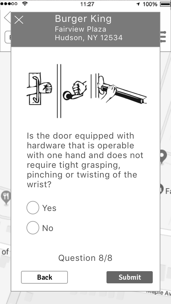
Use informative pictures to clarify or replace instructions whenever possible.
Use easy to digest visual tracking methods for users to see their progress.


Use animations, illustrations, and play to create moments of delight wherever possible and appropriate.
Incorporate visuals and language that illustrate a larger community whenever possible and appropriate.


I created three style tiles in order to test different possible directions our design could take.


I tested user responses to the different style directions using methods from Microsoft’s Desirability Toolkit. The testing process involved adjective matching, which my team then organized according to whether the adjectives were positive or negative and whether they aligned with the Voluntopia design principles. The results can be seen below.


Before creating mockups, we began with a critical evaluation of the wireframes given to us from the UX team. We conducted a round of user tests on the wireframes to validate the gamification concepts and confirm the usability of the microvolunteering activity flow. Our user testing uncovered two key issues:
Users generally reacted to the onboarding screens by saying that they would not read them and would instead skip through them quickly. Even for the users who read the onboarding screens there seemed to be some confusion over the gamification of the app. We addressed this issue by refining the language on the onboarding screens and trying to make them as succinct as possible.


The original microvolunteering activity consisted of having a user answer only one question to determine if an entire building is wheelchair accessible or not. Users responded by saying that they did not know how to assess an entire building. We improved the activity by breaking it down to a series of more simple and straightforward questions taken from the ADA guidelines.


After the usability issues were improved and the visual direction established, I iterated on the finer points of the visual designs in order to best achieve the design goals.
The initial designs of the activity cards made use of a lot of colors from the Voluntopia city illustration. The result was busy and not as cohesive.


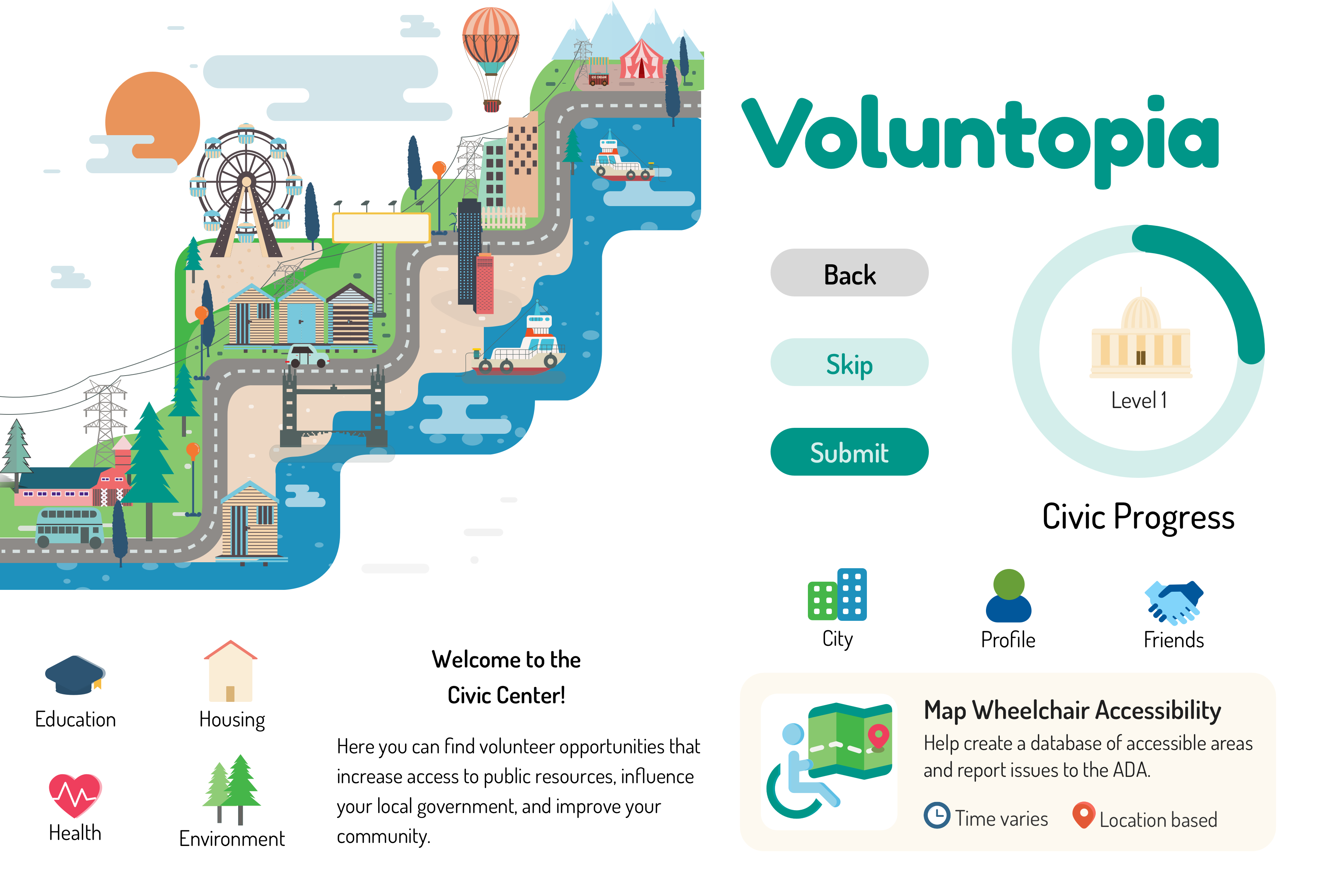
Users responded positively to the illustrated map that they could move around, but the illustration was sometimes reading as a little bland. I iterated on the illustration by adding more elements, but it was then a bit too much. The final iteration struck a balance so it feels interesting but not too busy.


Iterations on the Volunteering questions dealt mainly with the clarity of the answer buttons. Coloring the buttons according to their answer was misleading since users felt a green “Yes” was always a positive response. Additionally, too many color variants was visually distracting.


The final designs tried to emphasize the fun and gamifiied aspects of Voluntopia through the prominent incorporation of illustration. For the microvolunteering activity, the primary focus was on making the task clear, succinct, and meaningful.

Illustrations and animations are used to show the fun and gamified nature of Voluntopia. The map can be moved by the users and serves as a main navigation screen.


Instructions are kept minimal but clear. The goal is for users to be able to understand how to use the app quickly and easily.


The microvolunteering activity consists of straightforward questions that users can answer without expert knowledge. The activity is designed to file potential issues with the ADA so users can make an impact.

A prototype was created using Figma and Principle as a tool for user testing and as documentation of some of the intended animations. Feel free to try it the prototype by clicking the button below!
*Note: if the images are not loading for you in the prototype try opening it in an incognito window or clearing your cache. (This is a known bug in Figma.)
The following video shows a walk through of the main user flow from first opening the app to completing one microvolunteering activity.
A majority of users responded positively to the purpose of the app as well as the look and feel. Many users felt that they would use the app in place of many phone games, but would feel good about providing a service to the community.
"I would feel better about wasting time on my phone.”
- Leah, User Tester
Users responded positively to the aesthetics of the app as well.
“There’s a good range of colors that make it fun and exciting without being too busy.”
-Kate, User Tester
In general, the idea of gamifiying the progress through improving the Voluntopia city was motivating to users.
“It definitely would keep me coming back if I knew had to an improve this area, and I could compare with my friends.”
-Leah, User Tester
I think one of the biggest lessons I learned during this project was about scope creep. There were so many exciting opportunities to have grand ideas about lots of illustrations, animations, and gamification in addition to the ideas about how to make the app most effective at helping the community. I feel good that ultimately as a team we were able to cut down to the most essential components of the app: introducing the map concept and creating a viable volunteer activity flow. It would have been easy to get swept up in the gamified aspects of the app and neglect the user feedback about the volunteer activity being too difficult. Our final solution was a drastic improvement to the original, but with hindsight, I would say that we could have prioritized the volunteer activity flow earlier and saved ourselves time.

The microvolunteering activity of assessing handicap accessibility issues for a building could be expanded to include questions about the interior of the building. Questions could also be sorted according to type.
The purpose of the app is to have a repository of many microvolunteering activities. A critical next step for the project is to concept and design some more options.
The gamified parts of Voluntopia need to be tested further. Determining exactly how much effort is optimally required for a user to level up is one key example of the type of game testing to be done.
The scope of this project did not include designing a logo or establishing brand attributes. Creating a logo and including it's specifications in the style guide is a crucial next step.
During testing, users responded positively to the inclusion of people in some variations of the map illustrations. Due to this positive reaction and the design principle of showing the community, it is recommended that some illustrations of people be incorporated.