

Dabble is an online platform for finding and hosting unique experiences and classes.
Dabble's current goal is to grow as a company by increasing the number of hosts on the platform and the profit made by those hosts.
Our goal for the project was to design an improved flow for new hosts creating an event based on work provided by a previous UX team.

We looked at four direct and four indirect competitors to determine how to best set Dabble apart and what successful patterns could be adopted. A thorough audit was done of the competitors to determine how Dabble could best stand out. In order to make sure new users felt Dabble's personality and warmth, we recommended Dabble push it's visuals to be a bit more playful. Below are some key slides from our competitive analysis.
This page shows the four direct and four indirect competitors, listed with their logos.

Shown here are the main brand colors along with secondary colors used on the respective websites. Colors are shown in approximate percent used.

This page listed the main font families used by the competitors, with examples.

Here are shown examples of the competitors' use of photography and illustration.

This page shows the buttons and calls to action for the competitors.

All the competitors have prominent use of cards.

Here we compiled the competitors' implementations of tool tips and nudges. These were important since we knew our wireframes included tool tips.

The majority of the competitors use drawers on their site.

Only three competitors used carousels, with two of them being less prominent.

Three of the competitors have interesting microinteractions that provide inspiration.

Based on the competitive analysis, we determined that Dabble should stay close to it's current position, but could benefit from emphasizing playfuness and embracing clean design.

Dabble’s strongest distinguishing characteristics are creating a welcoming and supportive environment and establishing a sense of community. We wanted to make sure that these aspects of Dabble were clearly seen in the visuals and given prominence.
In order to establish design principles for the project we worked with CEO Jemal Swoboda to understand what the Dabble brand stands for. My team and I created four principles to represent the Dabble brand and guide our designs.
Show the user only the information they need at the time so using Dabble is easy and intuitive.
Create a community of teachers and learners with a friendly and accessible platform.
Build partnerships with members through real, hands-on support.
Build a sense of anticipation with moments of excitement and delight.


These design principles are the result of considering the competitive analysis, Dabble's current state, and discussions with Jemal.
I created three style tiles in order to test different possible directions our design could take.


In total my team had six style tiles and we tested them using methods from Microsoft’s Desirability Toolkit. Results from the test showed that users had brand loyalty and did not want to see drastic changes. However, they responded positively to the addition of more color and visual interest. My teammate and I then created a final, converged style tile based on the test results and input from the client.

We began with analyzing the wireframes given to us by the previous UX team and creating our initial high resolution designs. Throughout analyzing and later user testing we discovered some issues with the user flow given to us:
Upon analyzing the wireframes we noticed that features were missing from the user flow that were present on the current site. Additionally, there were some new features that would require a decent amount of development work to implement. We noted all the inconsistencies and conferred with Jemal to determine the correct content that should be in the flow.


Users who were impatient to start the event creation were frustrated and confused by the welcome and profile creation pages.


Impatient users were not only confused by the initial host steps, but also would try to skip ahead in the process.


After some of the major usability issues were ironed out we were able to turn our attention to the finer points of the visuals. We explored some diverging designs and iterated to ensure that we came up with the best possible solution.
The progress bar was one area where we continued to iterate. We wanted it to be notable, but not appear too busy or overwhelming. We also wanted to help the user understand that host steps were connected to creating an event. We also wanted to create clear completed, active, and inactive states.


We continued to iterate on the tool tip styling to try to make them playful and interesting, but also create a consistent system.


The profile page underwent a good deal of iterations to try to ensure that it was dynamic and interesting, while still being readable and trying to optimize the appearance when allowing for user uploaded photos.


The final designs struck a balance between being welcoming and playful but also straightforward and succinct. Highlights from the final design can be seen below.

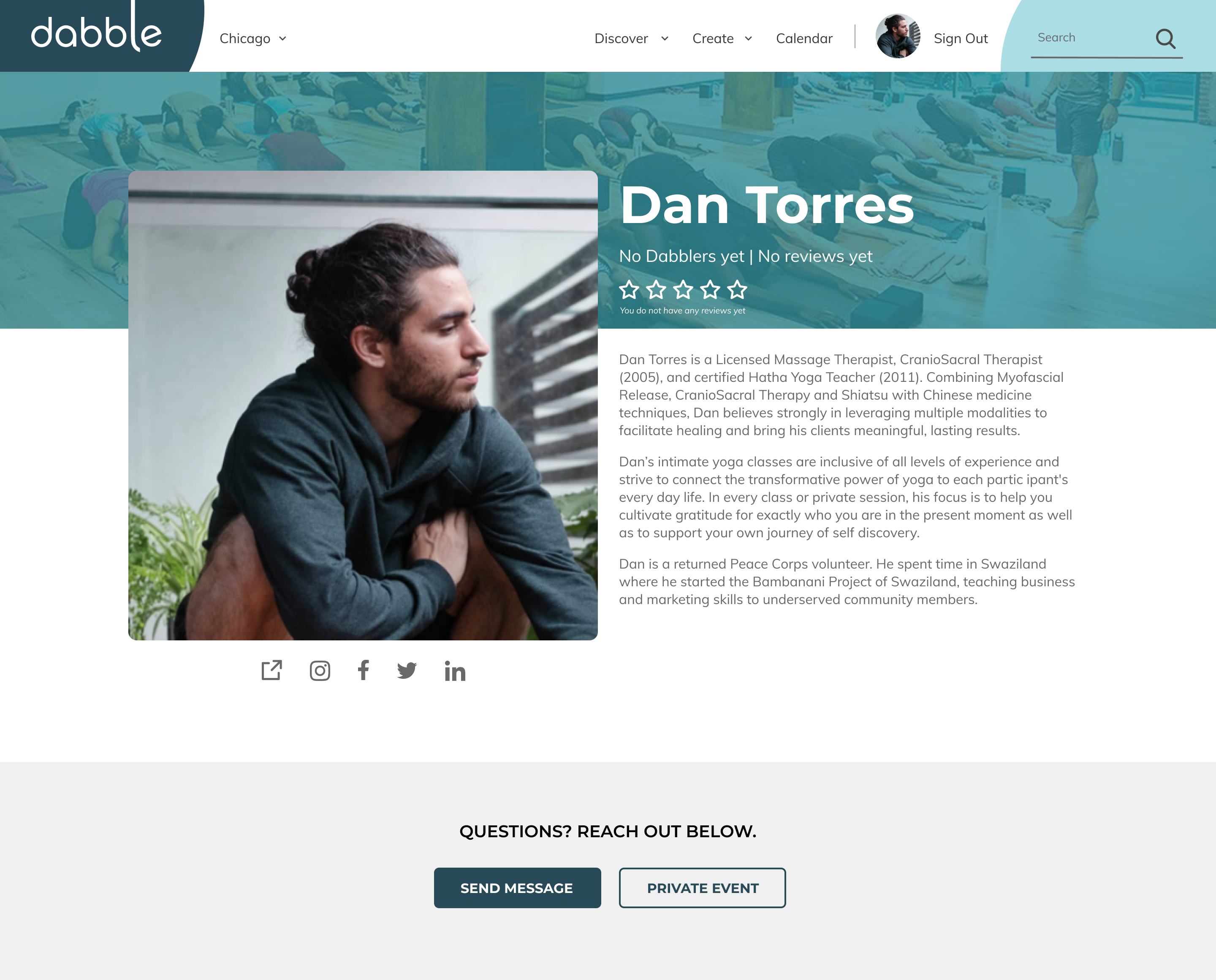
The welcome screen clearly states the overarching steps of the process to orient the user. Illustrations and a video of Jemal are used to aid in a sense of welcoming and community.


Illustrations were used to whenever possible and appropriate to create an engaging and warm atmosphere.


Care was taken to ensure that forms were logical and clear, with tips being useful but not essential.


Exciting or important information was given higher visual weight to help users easily navigate through the process.


The new visual system was applied to not only form pages, but also other pages relevant to the event creation process as a whole.

A prototype was created using Figma as a tool for user testing and as documentation of some of the intended interactions. Click the button below to interact with it:
The following video shows an active form field state and the intended functionality of the tool tips. Since tool tips are non-essential and usually pertain to specific form fields, it seemed appropriate to have them appear when the relevant form field was selected.
*Note: if the images are not loading for you in the prototype try opening it in an incognito window or clearing your cache. (This is a known bug in Figma.)
We also provided Jemal with a Style Guide so that he would be able to implement our design system across his entire site. Additionally, any future projects could follow this system that has been set up. Below are some key pages from our Style Guide.
(Left) The design principles are given to guide the brand. (Right) An established color palette is given for any future designs to utilize.


(Left) This page shows the system created for the typography and provides examples in context. (Right) The system for buttons includes primary and secondary buttons with various states for dark and light backgrounds.


All icons used in our designs are listed here and proper sizing, padding, and margins are specified based on recommended touch target sizes. (A library of additional icons was also provided.)
Two pages from the form fields section are shown here. This section details various from entry fields including different states, sizes, and functions. Spacing and typography within the elements is also detailed.


(Left) Another page from the form fields sections is shown. (Right) This page details the grid used in the designs, which has eight columns and follows an 8 px grid based on Google's Material Design.


Shown here is a library of illustrations that was provided. Examples of usage within the current designs is given, as well additional illustrations for future use.


The client was very pleased with the final designs. In particular, Jemal appreciated the thoroughness.
“You were detail oriented and I really appreciated your nuance of thinking through things … Thank you so much for all the great work” - Jemal Swoboda, Dabble CEO
Overall users responded favorably to the new screen designs in testing throughout the duration of the project. The new aesthetics were generally pleasing and an improvement from the current state.
"Way cooler than the current status of Dabble."
- Alexandria Willis, Shoemaker
A majority of users mentioned that they liked and appreciated the tool tips.
“I love the tips and examples. I think that is really helpful, and I love the pop of color.”
-Saya Hillman, Mac & Cheese Productions℠
This project had limited resources with only four weeks to design and one part-time developer to implement in the future. I am proud of how we were able to critically evaluate the user flow and make changes to the wireframes even though time wasn’t initially set aside for that. I think the changes were critical to a better user experience, and it was exciting to get to advocate for the user in a real-world situation. I’m also proud of how we were able to adapt quickly and improve on the aesthetics with a short turn around. We responded to stakeholder feedback while also ensuring the user experience was key. One lesson I learned from the project is that it is essential to take the necessary time to critically evaluate and consider. We did our best to carefully evaluate the wireframes, but in an ideal world we would have flagged the usability issues prior to testing and been prepared with alternatives to maximize our limited testing time. The other lesson I learned is to maximize time with stakeholders to get buy-in. Allowing stakeholders early say can help increase their buy-in for the final designs.

Due to the short duration of the project and the holiday season only one user test was done in the last sprint. More user tests should be done, especially to ensure user understanding of the progress bar.
There are several areas where the language on the site can be simplified, made more friendly, and made more consistent. The language for “event host,” “event partner,” or “teacher” needs to be clarified. One name should be used and tested.
As the site is responsive, decisions need to be made as to how the elements reflow on the new screens. Best practice would be to begin by designing wireframes for the mobile state and user testing them.
Developing the capability for users to edit their profiles and event details directly in a preview version of the final screen would make a huge impact on the ease of completion on these forms. We predict that this would result in better submitted content from users, which could lead to increased conversion rates.
The addition of illustrations to the site provides many opportunities for delightful user interactions. The illustrated figures could be animated to respond to user inputs in the form fields. We would recommend keeping these animations small and somewhat subtle, but small amounts of movement in the illustrations could add significantly to user feelings of engagement.
